Columns
Columns
Columns are defined separately on widget level to allow reuse over multiple tables.
Table columns should match the available graph data delivered by the service (e.g., title, state, owner). To get the correct data, use the exact property names from the node's data. Data preview is a good tool to find available node data. Columns can use datasets to display data from related nodes.
"columnExample" : {
    "label": "Title",
    "data": "title"
}
More examples
"columnsExamples": {
    "title" : {
        "label": "Title",
        "data": "title",
        "sticky": true,
        "width": 150
    },
    "related_tasks" : {
         "label": "Tasks",
         "iconSelect": "typeicon || type_icon_url || icon",
         "data": {
             "datasets": [
                 "relatedTasks"
             ],
             "select": "title"
         },
         "services": [
             "relatedTasks"
         ],
         "settings": {
             "usesAlternateOid": true,
             "dragAllAtOnce": true
         },
         "groupHeader": "Related"
     },
    "percentComplete" : {
        "data": "percentComplete",
        "label": "%",
        "settings": {
            "cellRenderer": "AUTO_COLOR_RENDERER",
            "cellRendererProps": {
                "customColorMappings": [
                    {
                        "range": {
                            "upperLimit": 10,
                            "inclusive": false
                        },
                        "color": "red"
                    },
                ]
            }
        }
    },
    "weight_rollup" : {
        "label": "Weight Rollup",
        "loadingLabel": "Calculating Rollup...",
        "width": 110,
        "settings": {
            "dependantOnService": "physicalProductServiceRollup",
            "datahandler": "rollup",
            "cellRenderer": "rollup",
            "edgeStatement": "[type='VPMInstance']",
            "nodeStatement": "[type='VPMReference']"
        },
        "data": "ds6wg:XP_VPMReference_Ext.Weight"
    }
}
Column properties
Below is the list of properties supported by column. Each property is annotated with its data type, optionality, description, and an example where applicable.
The column type jsonata is flexible and secure low-code format for generating complex cell content, the format allows configuration without deploying custom code (e.g. rollup values).
See: JSONata column type
The cellRenderer HANDLEBARS_TEMPLATE_RENDERER is a flexible and secure (full sanitation applies to the template output) low-code format for rendering cell values, the format allows configuration without deploying custom code (e.g. progress bar)
| Property Name | Description | Data Type | Required | Example |
|---|---|---|---|---|
data | Data select configuration. Supports simple key, array of keys/selectors, object selector, or JSONata expression when type is jsonata. | string / array string / object | no | "title" ["state", "stateNLS"] {"select": "title", "datasets": ["issueData"]} "$count(context)" |
datahandler | Advanced/custom data processing configuration. Built-in handler currently supported by schema is rollup. | object | no | {"name": "rollup"} |
colorFormatter | Applies badge-style coloring to rendered cell values (not the full table cell). Supports a value-to-color map object with optional default fallback. | object | no | {"default": "#f2f2f2", "Released": "#86efac", "Frozen": "#fecaca"} |
edit | In-cell edit configuration. Supports services, optional editSelect, and postUpdateNodeSelect for additional node field updates. | object | no | {"services": ["editProduct"], "editSelect": "partNumber"} |
editable | Set true for in-cell editing. | boolean | no | true |
filter | Enables/disables column-level filtering (default true). | boolean | no | false |
groupHeader | Will be displayed above all columns with the same group header. | string | no | "Scope Engineering Item" |
href | A component name reference to navigate into as the user clicks the link. | string | no | "CRs_Details_Navigate" |
hyperlink | URL template where {{value}} is replaced by the resolved cell value. | string | no | "https://example.com/issue/{{value}}" |
iconSelect | A data key for the icon URL e.g., 'typeIcon'. | string | no | "typeIcon" |
label | Will be presented in the table header to the user. | string | no | "Title" |
loadingLabel | What to display in the cell while loading service and processing datahandler. | string | no | "Loading..." |
ranges | Allowed values for select-like editing scenarios. | array string | no | ["Yes", "No"] |
services | Service key references to execute before rendering cell values. Use service keys only (no extension-qualified *.json.* form). | array string | no | ["scopeEngItem"] |
settings | Rendering/formatting behavior container (for example cellRenderer, cellRendererProps, dateFormat, style options). | object | no | {"cellRenderer": "AUTO_COLOR_RENDERER"} |
sortType | Custom sort behavior key for the column. | string | no | "alphanumeric" |
sticky | Sticks the column to the left. | boolean | no | true (for title) |
type | Built-in column types (typically shorthand for renderer and other settings). Enum: text, select, person, date, textarea, dropbox, dynamic, jsonata. | string | no | "person" |
valueFormatter | Custom value formatter object. Can be used for value presentation such as relative date/time formatting. | object | no | {"name": "currency", "valueFormatterProps": {"currency": "USD"}} |
visible | Controls if the column is visible. | boolean | no | true |
width | Forces a fixed column width in pixels. | integer | no | 150 |
Data
Below sub elements define how column.data should be configured
| Property Name | Description | Data Type | Required | Example |
|---|---|---|---|---|
datasets | Dataset definition name references. | array string | no | ["issueData"] |
isEdge | Controls if to select data from nodes or edges in dataset. | boolean | no | true |
nodeCondition | Cytoscape selector that scopes where this select is valid. Do not combine with datasets in the same selector object. | string | no | "[type='Issue']" |
select | A data key e.g., 'title' for advanced selection within data object. | string | no | "title" |
DataHandler
Below sub elements define how column.datahandler should be configured
| Property Name | Description | Data Type | Required | Example |
|---|---|---|---|---|
datahandlerProps | Additional options for custom datahandler. | object | no | { "edgeStatement": "[type='cost']" } |
name | Handler name which is same as register in custom resource plugin rollup. | string | yes | "rollup" |
DatahandlerProps
Below sub elements define how column column.datahandler.datahandlerProps should be configured
| Property Name | Description | Data Type | Required | Example |
|---|---|---|---|---|
edgeStatement | Used with the 'rollup' cellRenderer/dataHandler to define how to expand the graph for rollup calculation. A data filtering selector (where clause). See Cytoscape Selectors. Macros: {{contextId}}. | string | no | "[type='relatesTo']" |
nodeStatement | Used with the 'rollup' cellRenderer/dataHandler to define how to expand the graph for rollup calculation. A data filtering selector (where clause). See Cytoscape Selectors. Macros: {{contextId}}. | string | no | "[type='Issue']" |
Settings
Below sub elements define how column.settings should be configured
| Property Name | Description | Data Type | Required | Example |
|---|---|---|---|---|
cellRenderer | Cell renderer key. Built-ins include AUTO_COLOR_RENDERER, PERSON_RENDERER, ICON_RENDERER, rollup, HANDLEBARS_TEMPLATE_RENDERER, and FILE_MENU_RENDERER (custom keys also allowed). | string | no | "HANDLEBARS_TEMPLATE_RENDERER" |
cellRendererProps | Renderer options (for example customColorMappings, customIconMappings, template, strictVariables). | object | no | {"template": "<div>{{value}}</div>"} |
dateFormat | Apply a date format pattern e.g., 'YYYY-DD-MM'. | string | no | "YYYY-MM-DD" |
dateFormatOptions | Additional date formatting options. | object | no | { "locale": "en-US", "options": { "year": "numeric", "month": "long", "day": "numeric" } } |
dependantOnService | Service key that this column depends on for data/behavior updates. | string | no | "fetchAllIssues" |
dragAllAtOnce | Drag all related column data together in one go, if multiple rows are selected includes related column data too. | boolean | no | true |
headerRenderer | Custom renderer key for the column header. | string | no | "HANDLEBARS_TEMPLATE_RENDERER" |
headerRendererProps | Props to pass into the header renderer (for example template, strictVariables). | object | no | {"template": "<span>{{header}}</span>"} |
includeBlankValue | When true, keeps empty values in dataset/multi-value results so each related object still renders a placeholder line and values stay aligned across columns. | boolean | no | true |
renderAsMultiValue | TODO (purpose unclear in schema; possibly for multi-value rendering). | boolean | no | true |
showFullName | Used with the built-in person renderer to control if to display the full name (true is default, false display full name in tooltip only). | boolean | no | false |
styleCell | CSS styles for the data cell. | object | no | {"whiteSpace": "nowrap"} |
styleCellValue | Applies styling by using any CSS. Style is applied on cell value. | object | no | {"fontWeight": "bold"} |
styleHeader | CSS styles for the header cell. | object | no | {"fontWeight": "600"} |
usesAlternateOid | If true, makes the data represented by the dataset draggable (single or multi value depending on dragAllAtOnce). | boolean | no | true |
CellRenderer
Built in column.settings.cellRenderer
| Cell Renderer | Description | Example |
|---|---|---|
AUTO_COLOR_RENDERER | This cell renderer generates the colored back ground for the cell value, based on the actual text value. It is useful for column which have fixed ranges like states, priority. It gives a more visually appealing cell with back ground and text color in contrast. It also supports addition properties via cellRendererPropsSame text will generate same back ground color | "settings": { "cellRenderer": "AUTO_COLOR_RENDERER", "cellRendererProps": { "customColorMappings": [ { "range": { "upperLimit": 10, "inclusive": false }, "color": "red" }, ] } } |
HANDLEBARS_TEMPLATE_RENDERER | Renders custom HTML-like output from a Handlebars template. For cell rendering, configure settings.cellRendererProps.template; for header rendering, configure settings.headerRendererProps.template. If omitted, default templates are {{value}} (cell) and {{header}} (header). | "settings": { "cellRenderer": "HANDLEBARS_TEMPLATE_RENDERER", "cellRendererProps": { "template": "<span>{{displayValue}}</span>", "strictVariables": true } } |
ICON_RENDERER | This cell renderer is used to show icons instead of plan text value. For example in case of priority or severity, icons can be shown instead of text value. These icons will be based on mapping between value and corresponding icon. Additional cellRendererProps is used to define the mapping. | "severity" : { "label": "Severity", "data": "severity", "settings": { "cellRenderer": "ICON_RENDERER", "cellRendererProps": { "customIconMappings": [ { "value": "Low", "icon": "level-low-icon", "color": "green" }, { "value": "High", "icon": "level-high-icon", "color": "red" }, { "value": "Medium", "icon": "levelmedium-icon", "color": "orange" } ] } } }, |
PERSON_RENDERER | This cell renderer generates the colored back ground for the person name together along with rounded initials box for quick identification.Same person name will generate same back ground color and initials box | "owner" : { "label": "Owner", "type": "person", "data": "owner.user", "settings": { "cellRenderer": "PERSON_RENDERER", "cellRendererProps": { "showFullName": true } } } |
FILE_MENU_RENDERER | Renders a per-file action toolbar for each file node associated with a row. Displays upload, download, edit, lock/unlock, update, and delete icon buttons. The visible button set changes based on the file's locked state. File nodes are sourced from the column's valuesWithSelect data (populated via datasets). Built-in services are auto-injected and can be overridden per consumer config. See File Menu Renderer. | "files": { "label": "Files", "data": { "datasets": ["documentsData"], "select": "title" }, "settings": { "cellRenderer": "FILE_MENU_RENDERER", "cellRendererProps": { "icons": { "add": "wux-ui-3ds-upload", "upload": "wux-ui-3ds-upload", "download": "wux-ui-3ds-download", "edit": "wux-ui-3ds-edit", "lock": "wux-ui-3ds-lock", "unlock": "wux-ui-3ds-unlock", "update": "wux-ui-3ds-update", "editUnlock": "wux-ui-3ds-lock-open", "updateUnlock": "wux-ui-3ds-update-unlock", "delete": "wux-ui-3ds-delete" } } } } |
CellRendererProps
Below sub elements define how column column.settings.cellRendererPropsshould be configured
| Property Name | Description | Data Type | Required | Example |
|---|---|---|---|---|
colorize | Used by ICON_RENDERER to colorize icon output based on cell value. | boolean | no | true |
customColorMappings | Color mapping rules used by AUTO_COLOR_RENDERER (value-based and/or range-based). | array object | no | [ { "color": "#FF0000", "value": "High" }, { "color": "#00AA00", "range": { "lowerLimit": 1, "upperLimit": 10, "inclusive": true } } ] |
customIconMappings | Value-to-icon mappings used by ICON_RENDERER. Schema requires at least value and icon per item. | array object | no | [ { "value": "Open", "icon": "wux-ui-3ds-flag", "iconFamily": "DSFontIcon", "color": "#00FF00" } ] |
defaultIcon | Fallback icon used by ICON_RENDERER when no mapping matches. | string | no | "wux-ui-3ds-flag" |
fixedColorMappings | Fixed value-to-color map used by AUTO_COLOR_RENDERER. | object | no | {"High": {"color": "#FF0000", "textColor": "white"}} |
icons | Icon configuration object used by FILE_MENU_RENDERER. Maps action keys to CSS icon class names. See Icons. | object | no | {"add": "wux-ui-3ds-plus"} |
strictVariables | Controls Handlebars strict mode. Default behavior is true; set to false to allow missing variables without failing rendering. | boolean | no | true |
template | Handlebars template string used by HANDLEBARS_TEMPLATE_RENDERER. For cell templates, context includes value, rawValue, displayValue, and rawObject (when available). See Handlebar templates. | string | no | "<span>{{displayValue}}</span>" |
useFormattedValue | If true, resolve color mappings using formatted value instead of raw value. | boolean | no | false |
valueIconMappings | Value-driven mappings for ICON_RENDERER with optional default/callback/plugin metadata. | array object | no | [ { "value": "Open", "icon": "wux-ui-3ds-flag" }, { "default": true, "icon": "wux-ui-3ds-help" } ] |
CustomColorMappings
Below sub elements define how column column.settings.cellRendererProps.customColorMappings should be configured
| Property Name | Description | Data Type | Required | Example |
|---|---|---|---|---|
color | The color. If HEX (e.g., #FF0000) is used for background, a matching foreground color is applied. | string | no | "#FF0000" |
range | Defines a numeric range to apply color. | object | no | { "upperLimit": 100, "lowerLimit": 50, "inclusive": true } |
value | The cell value to map a colour with. | string | no | "High" |
CustomColorMappings.range
Below sub elements define how column column.settings.cellRendererProps.customColorMappings.range should be configured
| Property Name | Description | Data Type | Required | Example |
|---|---|---|---|---|
inclusive | Control if to include the range limit value or not (== vs >=). | boolean | no | true |
lowerLimit | The lower limit numeric range to apply color. | number | no | 50 |
upperLimit | The upper limit numeric range to apply color. | number | no | 100 |
CustomIconMappings
Below sub elements define how column column.settings.cellRendererProps.customIconMappings should be configured
| Property Name | Description | Data Type | Required | Example |
|---|---|---|---|---|
color | A colour e.g., #FF0000. | string | no | "#00FF00" |
icon | Either a DSFontIcon or Entypo icon key e.g., 'wux-ui-3ds-flag'. | string | no | "wux-ui-3ds-flag" |
iconFamily | The icon family to use. Enum: DSFontIcon, entypo. | string | no | "DSFontIcon" |
value | The data value to map. | string | no | "Open" |
Icons
Below sub elements define how column column.settings.cellRendererProps.icons should be configured for FILE_MENU_RENDERER
| Property Name | Description | Data Type | Required | Example |
|---|---|---|---|---|
add | Icon class for the row-level upload button. Creates a new file on the document. Shown at the top of the cell regardless of lock state. | string | no | "wux-ui-3ds-upload" |
delete | Icon class for the delete button. Removes the file from the document. | string | no | "wux-ui-3ds-delete" |
download | Icon class for the download button. Available when the file is not locked. | string | no | "wux-ui-3ds-download" |
edit | Icon class for the edit button. Downloads the file for editing and automatically locks it. Available when the file is not locked. | string | no | "wux-ui-3ds-edit" |
editUnlock | Icon class for the cancel-edit button. Unlocks the file without committing changes. Available when the file is locked. | string | no | "wux-ui-3ds-lock-open" |
lock | Icon class for the lock button. Locks the file. Available when the file is not locked. | string | no | "wux-ui-3ds-lock" |
unlock | Icon class for the unlock button. Unlocks the file. Available when the file is locked. | string | no | "wux-ui-3ds-unlock" |
update | Icon class for the update button. Opens a file picker to upload a new revision (REVISE). Available when the file is not locked. | string | no | "wux-ui-3ds-update" |
updateUnlock | Icon class for the update-and-unlock button. Uploads a new revision and unlocks the file. Available when the file is locked. | string | no | "wux-ui-3ds-update-unlock" |
upload | Icon class for the per-file upload button. Adds a new file to the document. | string | no | "wux-ui-3ds-upload" |
DateFormatOptions
Below sub elements define how column.settings.dateFormatOptions should be configured
| Property Name | Description | Data Type | Required | Example |
|---|---|---|---|---|
locale | Locale for date formatting. | string | no | "en-US" |
options | Options for date formatting (year, day, month). | object | no | { "year": "numeric", "day": "numeric", "month": "long" } |
HeaderRendererProps
Below sub elements define how column.settings.headerRendererProps should be configured
| Property Name | Description | Data Type | Required | Example |
|---|---|---|---|---|
strictVariables | Controls Handlebars strict mode for header templates. Default behavior is true; set to false to allow missing variables without failing rendering. | boolean | no | true |
template | Handlebars template string for settings.headerRenderer = "HANDLEBARS_TEMPLATE_RENDERER". Header template context includes header, field, and columnIndex. See Handlebar templates. | string | no | "<span>{{header}} ({{columnIndex}})</span>" |
ValueFormatter
Below sub elements define how column.valueFormatter should be configured
| Property Name | Description | Data Type | Required | Example |
|---|---|---|---|---|
name | Formatter type. | string | yes | "currency" |
valueFormatterProps | Additional options for custom value formatter. | object | no | {"currency": "USD"} |
Details
Handlebars templates
The cellRenderer HANDLEBARS_TEMPLATE_RENDERER is a flexible and secure low-code format for rendering cell values, the format allows quick configuration without writing and deploying custom code. Full sanitation applies to the template output.
See https://handlebarsjs.com for more details.
The AI assistant can quickly generate templates for you.
Handlebar example column
The below % column is using a handlebar template.
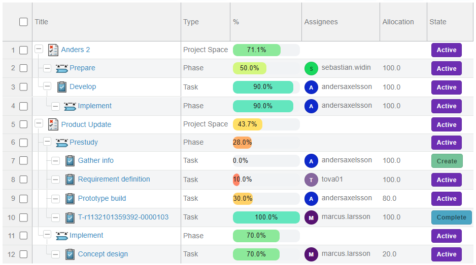
Example configuration
"data": "percentComplete",
"label": "%",
"settings": {
  "cellRenderer": "HANDLEBARS_TEMPLATE_RENDERER",
  "cellRendererProps": {
    "template": "<div data-style='{\"width\":\"100%\",\"backgroundColor\":\"#f1f3f5\",\"borderRadius\":\"8px\",\"height\":\"14px\",\"overflow\":\"hidden\"}'><div data-style='{\"width\":\"{{value}}%\",\"height\":\"100%\",\"backgroundColor\":\"{{#if (gte value 80)}}#28a745{{else}}{{#if (gte value 40)}}#f1c40f{{else}}#e74c3c{{/if}}{{/if}}\",\"borderRadius\":\"8px\",\"textAlign\":\"center\",\"fontSize\":\"10px\",\"lineHeight\":\"14px\",\"color\":\"#111\"}'>{{value}}%</div></div>",
    "strictVariables": true
  }
}
Styling
The style attribute is sanitized for security reasons. Instead use the data-style attribute with react camelCase styling syntax. Safe style properties only will be included in the resulting html.
Example styling
{
  "width":"{{value}}%",
  "height":"100%",
  "backgroundColor":"{{#if (gte value 80)}}#28a745{{else}}{{#if (gte value 40)}}#f1c40f{{else}}#e74c3c{{/if}}{{/if}}",
  "borderRadius":"8px",
  "textAlign":"center",
  "fontSize":"10px",
  "lineHeight":"14px",
  "color":"#111"
}
Handlebars input
Handlebars uses an input object to generate HTML. Handlebars templates look like regular text with embedded Handlebars expressions.
<p>{{value}}</p>
A handlebars expression is a {{, some contents, followed by a }}. When the template is executed, these expressions are replaced with values from an input object.
<p>Some text</p>
| Expression | Description | Example config | Example result |
|---|---|---|---|
{{value}} | The display value that is rendered by default on plain columns | <p>{{value}}</p> | Physical Product |
{{displayValue}} | The display value that is rendered by default on plain columns | <p>{{displayValue}}</p> | Physical Product |
{{rawValue}} | The unformatted raw value as selected from the graph | <p>{{rawValue}}</p> | VPMReference |
{{rawObject}} | Used in case the cell value outputs an object. To generate complex multi value object output to base the rendering on use a dataHandler or a jsonata column. | <p>{{rawObject.assignee}} ({{rawObject.allocation}}%)</p> | Tom (50%) |
{{<rawObjectProperty>}} | Top level raw object keys are accessible directly from the input object. | <p>{{assignee}} ({{allocation}}%)</p> | Tom (50%) |
Strict input
When strictVariables is true missing input handlebar expressions will return an empty rendering. If you want a relaxed rendering set strictVariables to false and the template will render even with the missing input.
Handlebars helpers
Available helpers in HANDLEBARS_TEMPLATE_RENDERER templates:
eq,ne,gt,gte,lt,lteand,or,notdateNowMS,dateNowISOdateISOToMS,dateToISOdateDayOfWeek,dateMonth,dateYear,dateISOWeek
Example helper usage:
JSONata column type
The column type jsonata is flexible and secure low-code format for generating complex cell content, the format allows configuration without deploying custom code (e.g. rollup values). The JSONata expression is evaluated per row. The column type framework pass a json payload with the full normalized graph data to the JSONata evaluation.
JSON payload format: { context: string[], nodes: object[], edges: object[] } where the context holds local node/edge IDs for the current row/cell and node/edge holds all graph-wide data.
The below Assignee Allocation column is using a jsonata to generate the rollup allocation by assignee for the full child structure.
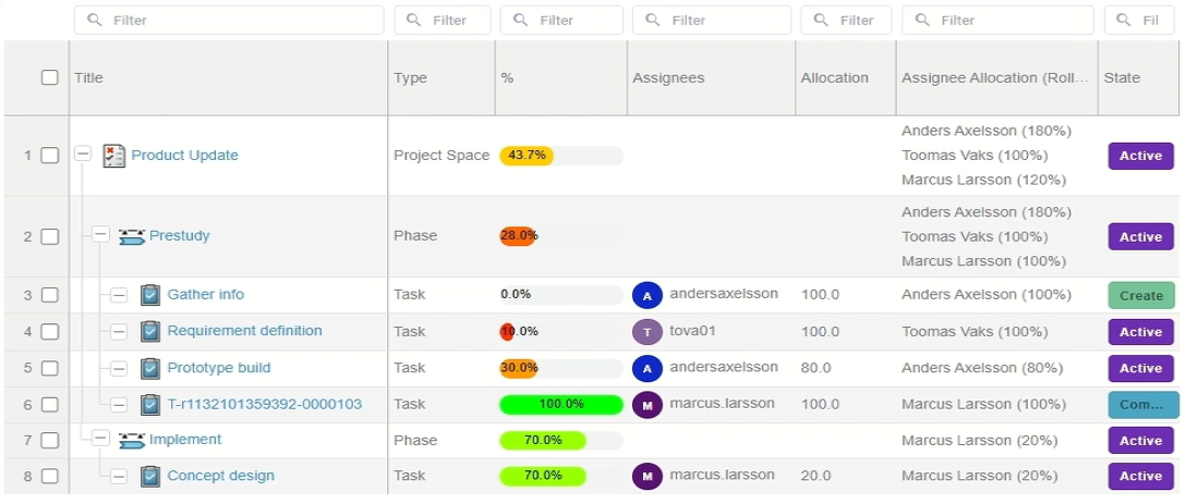
The JSONata syntax is hard to learn. The built in AI assistant knows the JSON payload format and have access to tools for generating and validating JSONata for you.
See https://docs.jsonata.org for details on JSONata. https://try.jsonata.org is a great tool to try your expressions on payloads.
Examples:
$count(context)
$join(context, ', ')
nodes[id in %.context][0].type
(
  $root := $filter(
    context,
    function($cid) {
      $count(
        $filter(
          nodes,
          function($n) {
            $n.id = $cid
          }
        )
      ) > 0
    }
  )[0];

  $desc := function($ids) {
    (
      $childEdges := $filter(
        edges,
        function($e) {
          $e.type = 'tasks' and $count($ids[$ = $e.source]) > 0
        }
      );

      $childIds := $distinct($childEdges.target);

      $count($childIds) = 0
        ? []
        : $append($childIds, $desc($childIds))
    )
  };

  $allChildIds := $distinct($desc([$root]));

  $childNodes := $filter(
    nodes,
    function($n) {
      $count($allChildIds[$ = $n.id]) > 0
    }
  );

  $types := $map(
    $childNodes,
    function($n) {
      $n.type
    }
  );

  $uniqueTypes := $distinct($types);

  $join(
    $map(
      $uniqueTypes,
      function($t) {
        $t & '(' & $count($filter($types, function($x) { $x = $t })) & ')'
      }
    ),
    ', '
  )
)
File Menu Renderer
FILE_MENU_RENDERER renders a per-file action toolbar inside a table cell. For each file node associated with the row, it displays a row of icon buttons that invoke document management services (upload, download, edit, lock, unlock, update, delete). The button set adapts based on whether the file is currently locked.
Overview
- Row-level upload: An optional
addicon at the top of the cell lets users attach a new file to the parent document without selecting a specific existing file. - Per-file buttons: For each file node, action icons are rendered. Which icons appear depends on the
lockerfield: if the file is not locked the unlocked set is shown; if it is locked the locked set is shown. - Indirect (relationship) nodes: If
valuesWithSelectcontains items with bothsourceandtargetfields, they are treated as relationship connector nodes. Thetargetis used as the file id and thesourceoverrides theparentContextIdused in service calls (for scenarios such as product → document → files).
Unlocked file buttons: upload, download, edit, lock, update, delete
Locked file buttons: upload, editUnlock, unlock, updateUnlock, delete
Data format (valuesWithSelect)
The renderer reads file nodes from the valuesWithSelect array provided by the table cell. Each element represents one property of one file node:
| Field | Description |
|---|---|
id | The file or document node ID. Items without an id are ignored. |
selectItem | The property name for this item. Recognised values: title, locker, docTitle, source, target. |
displayValue / value | The value for the property. displayValue takes priority. |
Items sharing the same id are grouped into a single file node object. A node with both source and target set is treated as a relationship connector and is excluded from rendering.
selectItem value | Description |
|---|---|
title | File name shown in the cell label. |
docTitle | Document title. If present, used in place of title for display. |
locker | Who currently holds the lock, or empty string / absent when not locked. |
source | Source node id for an indirect relationship connector. |
target | Target node id for an indirect relationship connector. |
Built-in services
The following services are automatically available for any column using FILE_MENU_RENDERER. They do not need to be declared in the consumer config. Any of them can be overridden by declaring a service with the same key in the consumer configuration.
| Service key | HTTP method | Purpose |
|---|---|---|
checkinTicket | PUT | Obtains an upload ticket. Chains into checkin. |
checkin | POST | Performs the file check-in using the ticket URL. Chains into uploadDocument. |
uploadDocument | PUT | Attaches the uploaded file to the document. Chains into unLockDocument. |
downloadDocument | PUT | Obtains a download ticket for the file. |
editDocument | PUT | Obtains a download ticket for edit. The renderer automatically calls lockDocument after a successful response. |
lockDocument | POST | Locks the file. |
unLockDocument | POST | Unlocks the file (also used for cancel-edit). |
deleteDocument | PUT | Removes the file from the document. |
Example column configuration
"files": {
    "label": "Files",
    "data": {
        "datasets": ["documentsData"],
        "select": "title"
    },
    "settings": {
        "cellRenderer": "FILE_MENU_RENDERER",
        "cellRendererProps": {
            "icons": {
                "add": "wux-ui-3ds-upload",
                "upload": "wux-ui-3ds-upload",
                "download": "wux-ui-3ds-download",
                "edit": "wux-ui-3ds-edit",
                "lock": "wux-ui-3ds-lock",
                "unlock": "wux-ui-3ds-unlock",
                "update": "wux-ui-3ds-update",
                "editUnlock": "wux-ui-3ds-lock-open",
                "updateUnlock": "wux-ui-3ds-update-unlock",
                "delete": "wux-ui-3ds-delete"
            }
        }
    }
}